Axotan is a growing Swedish company, their field is consumables with focus on stoma and wound care
products.

Axotan used the visual guidelines from one of their biggest selling brand. When the company grew they
wanted to communicate their own branding, which I have developed.

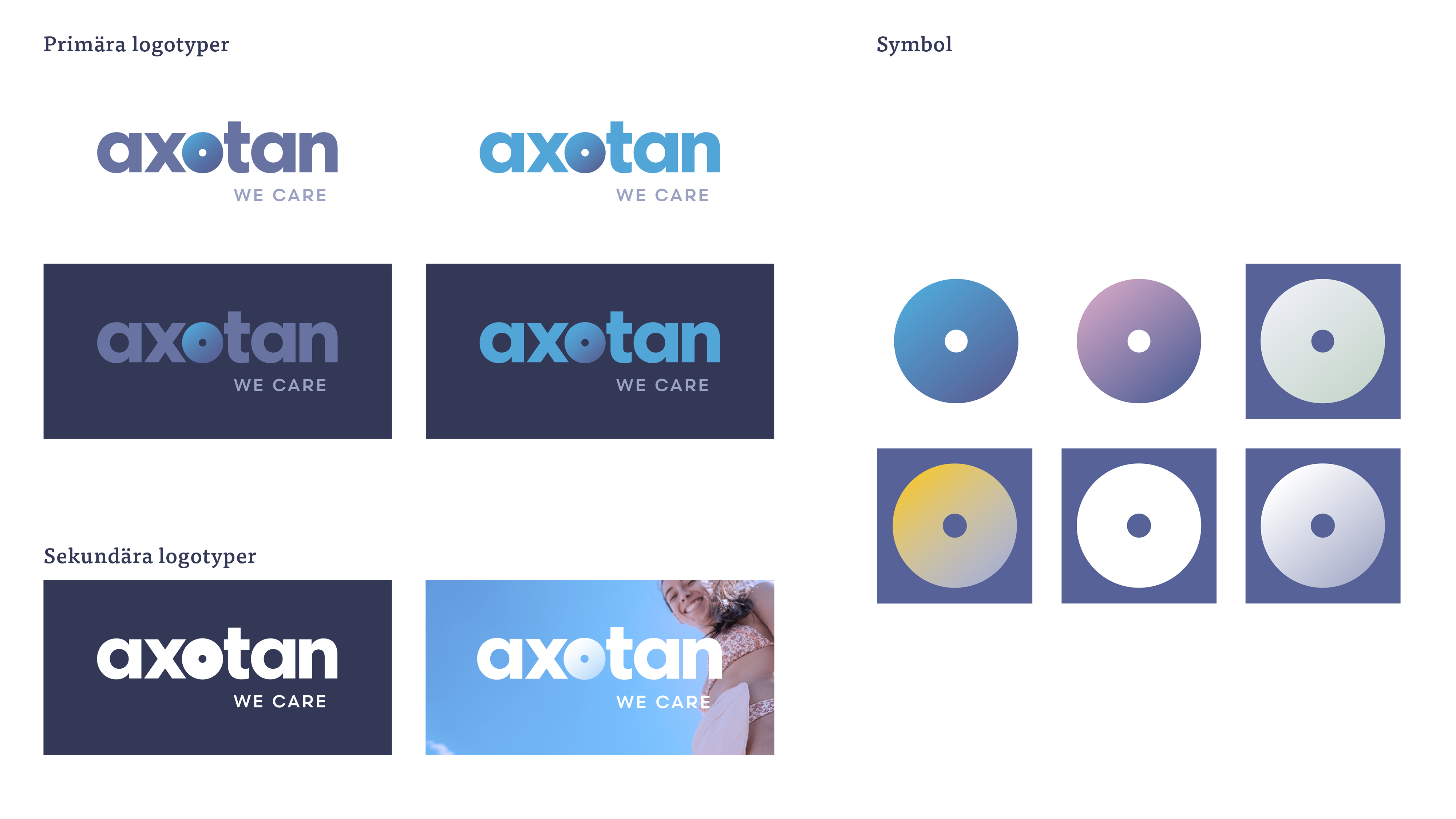
I embedded the symbol, relating to stoma care, in the name of Axotan. The illustrations, typeface,
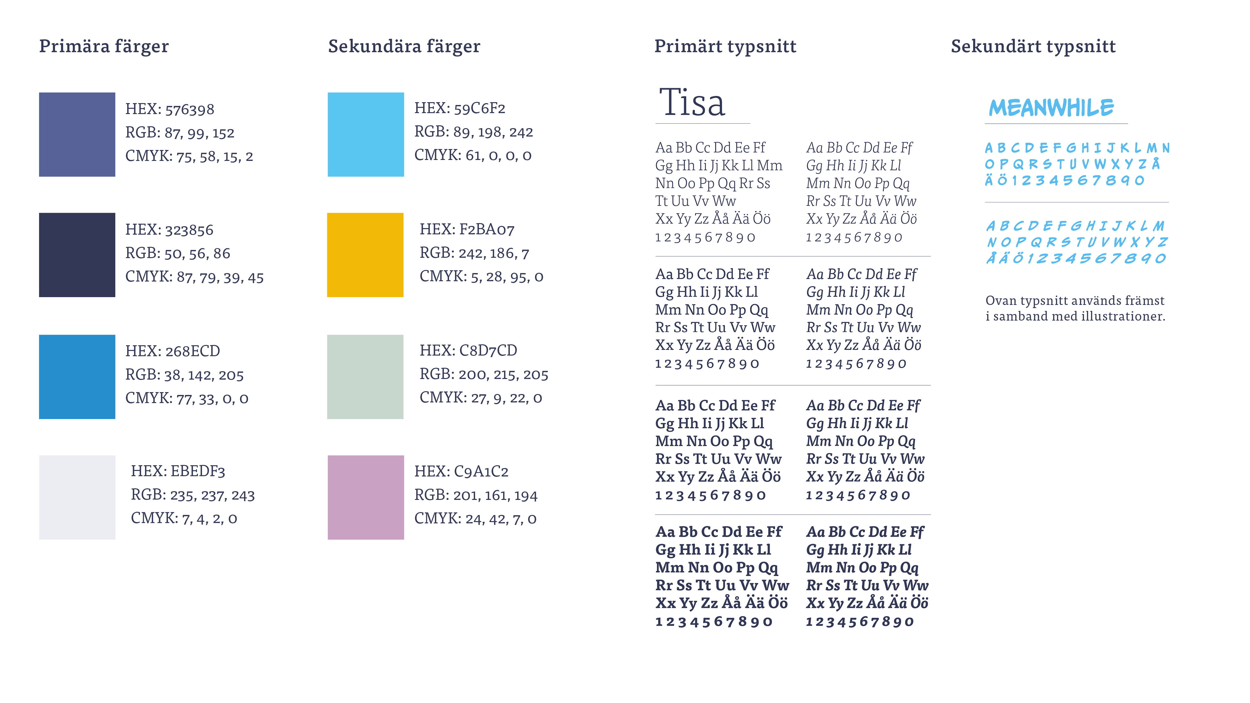
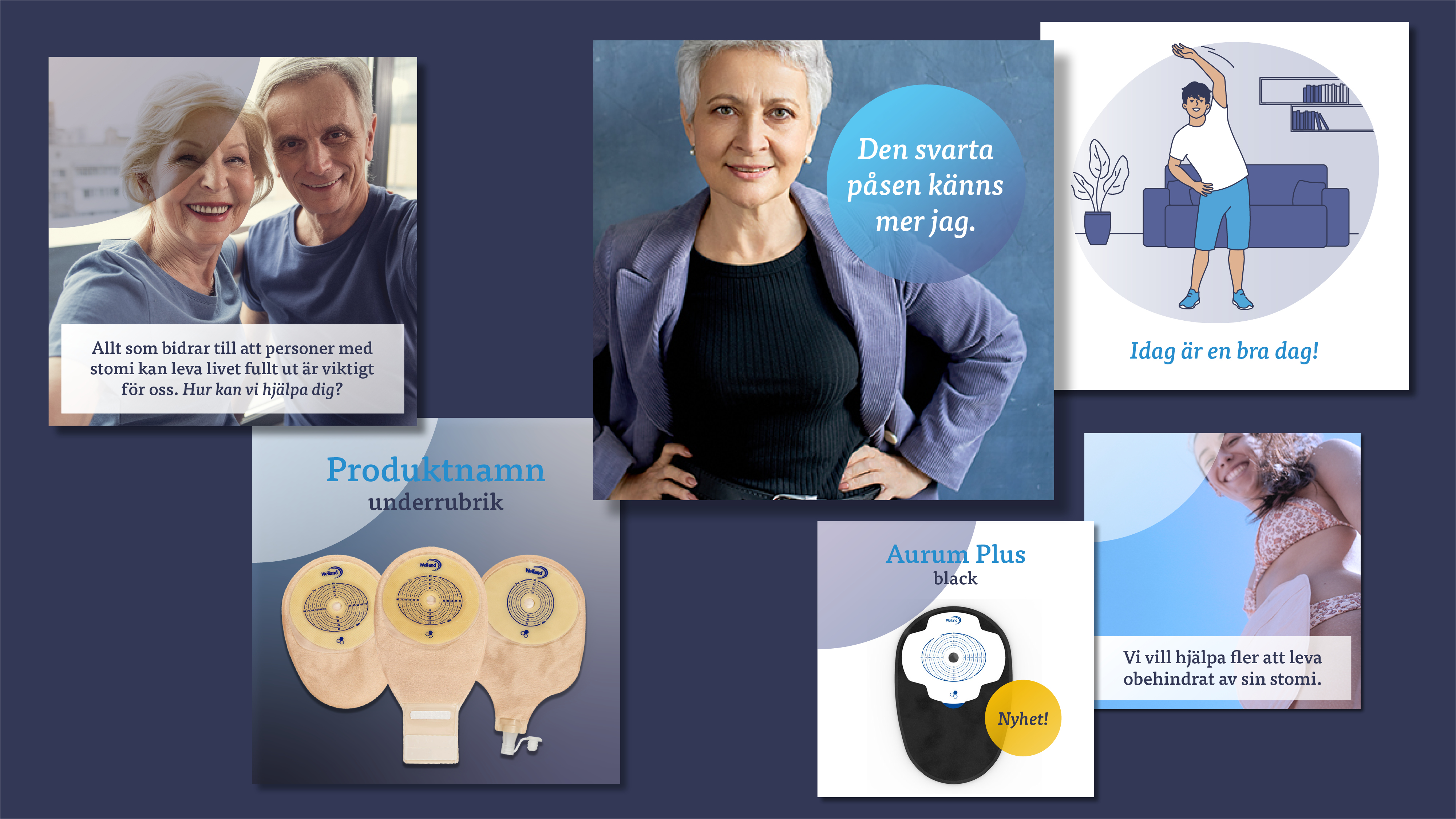
colors and image direction express competence and a friendly tone.

It’s a brief brand guideline. However, with all the elements the brand communicates personality and
care, and it’s a brand that now stands out among the competitors.
