The world’s largest Autodesk Solution Partner, Symetri, creates and
provides technology solutions and services for design, engineering,
construction and manufacturing businesses. I’ve been rebranding
their visual identity.
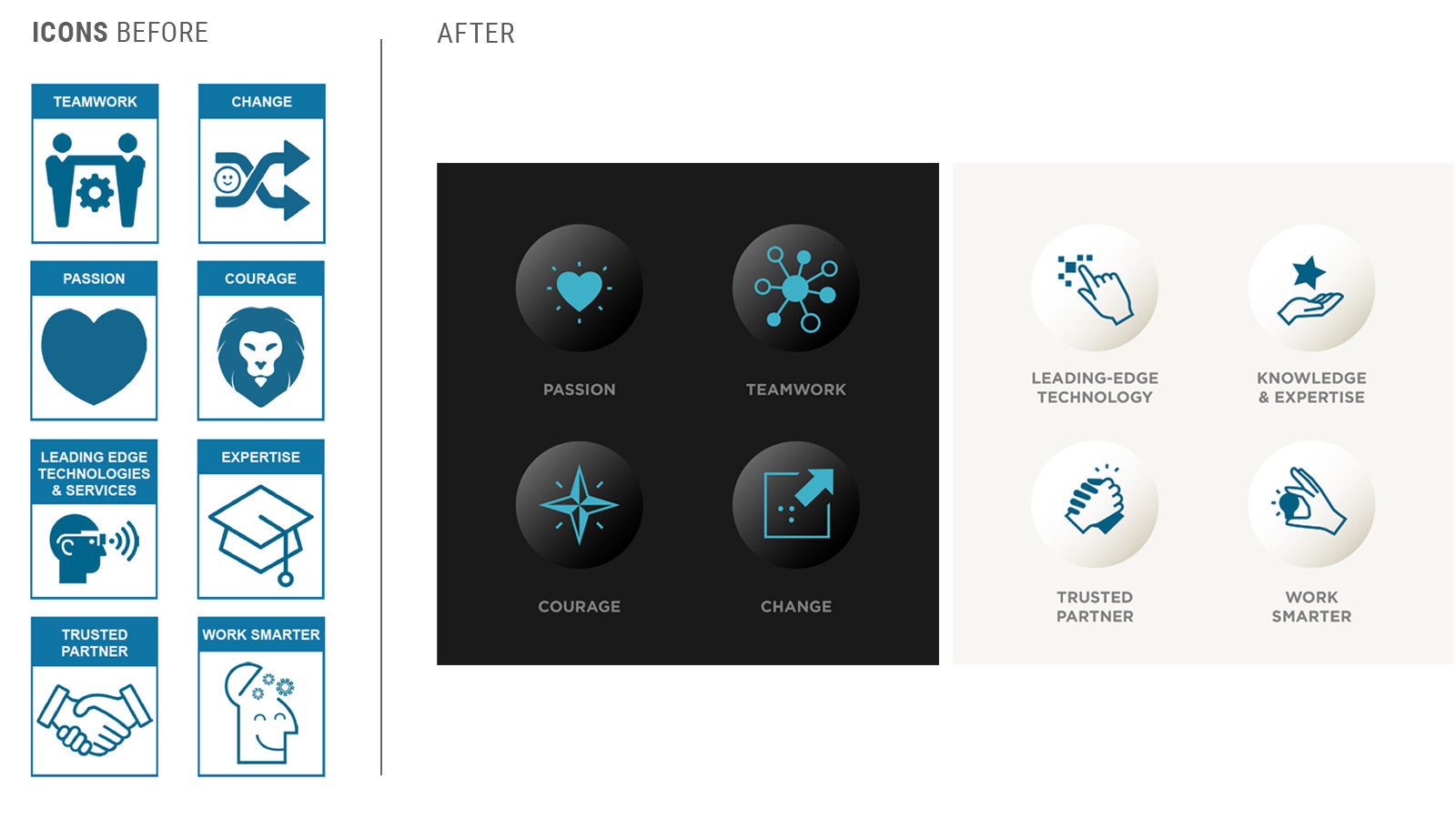
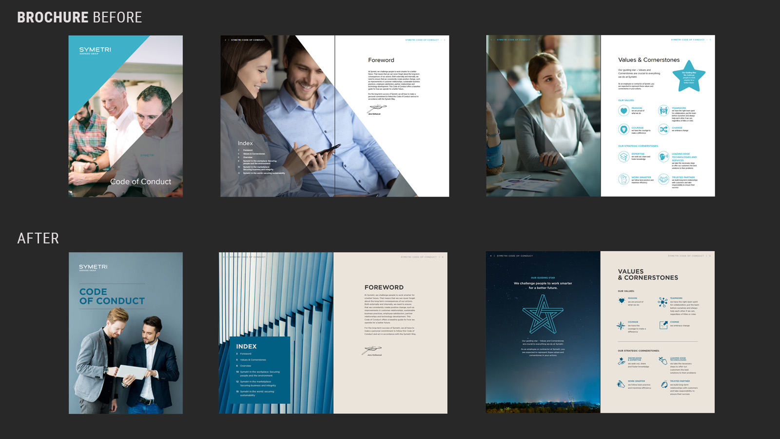
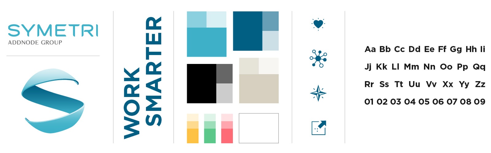
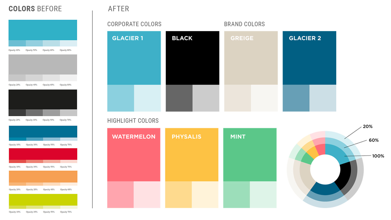
The challenge was to retain some of the elements, such as the
logotype and some of the colors, develop a new visual element to
strengthen the identity further and create an overall consistent look
and feel.
With insights that pointed towards a confident partner that doesn't
hesitate to take the lead, I focused on the refined message “work
smarter”.
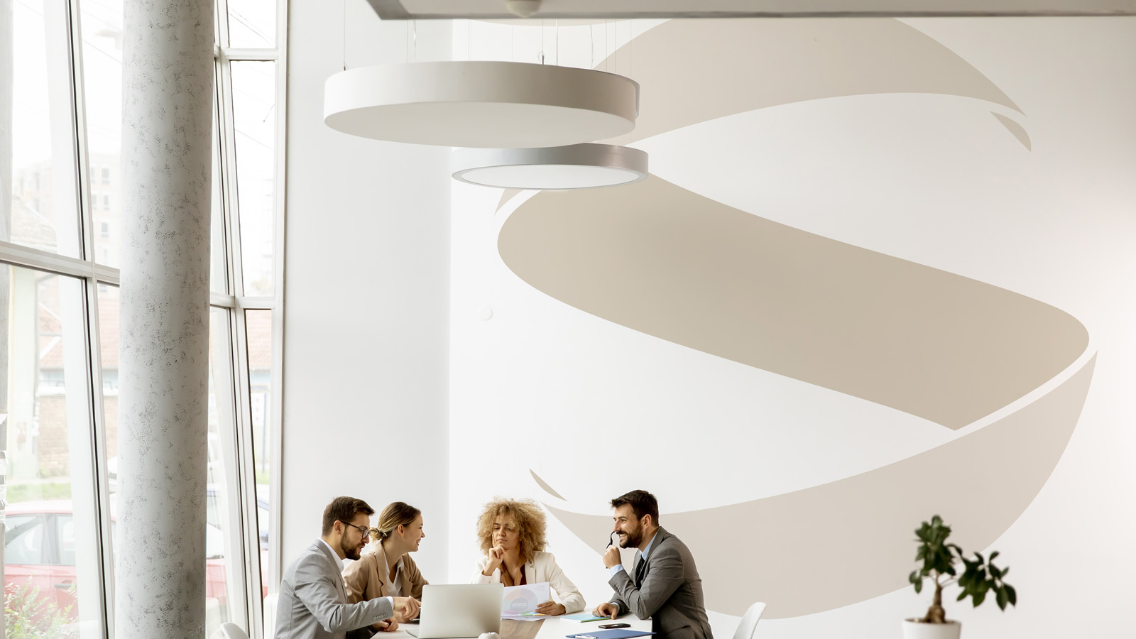
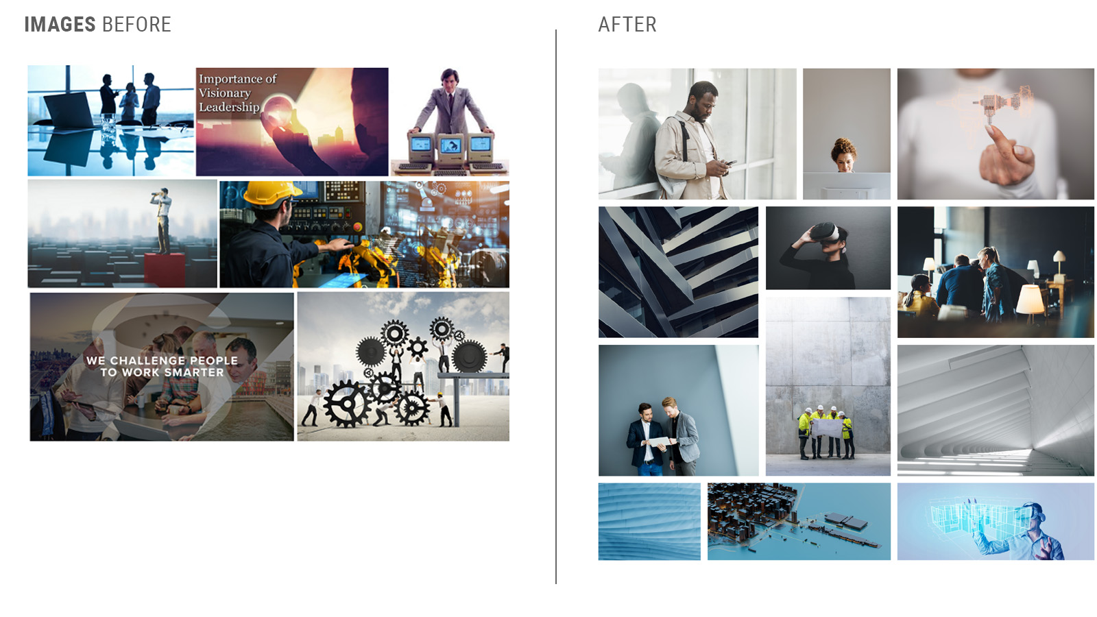
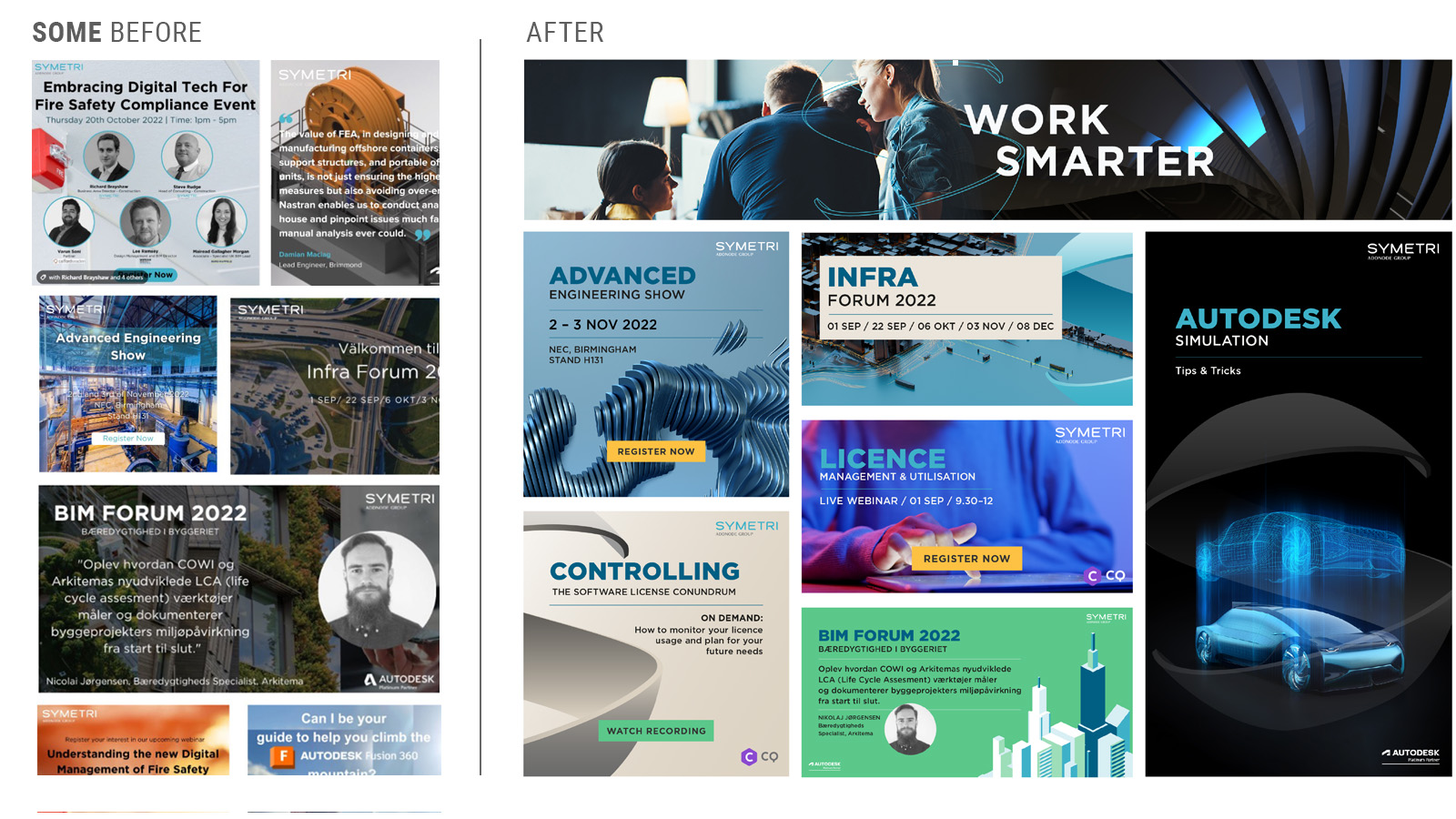
- The image style went from scattered to color homogenic, with generous space to express a sense of calm and confidence.
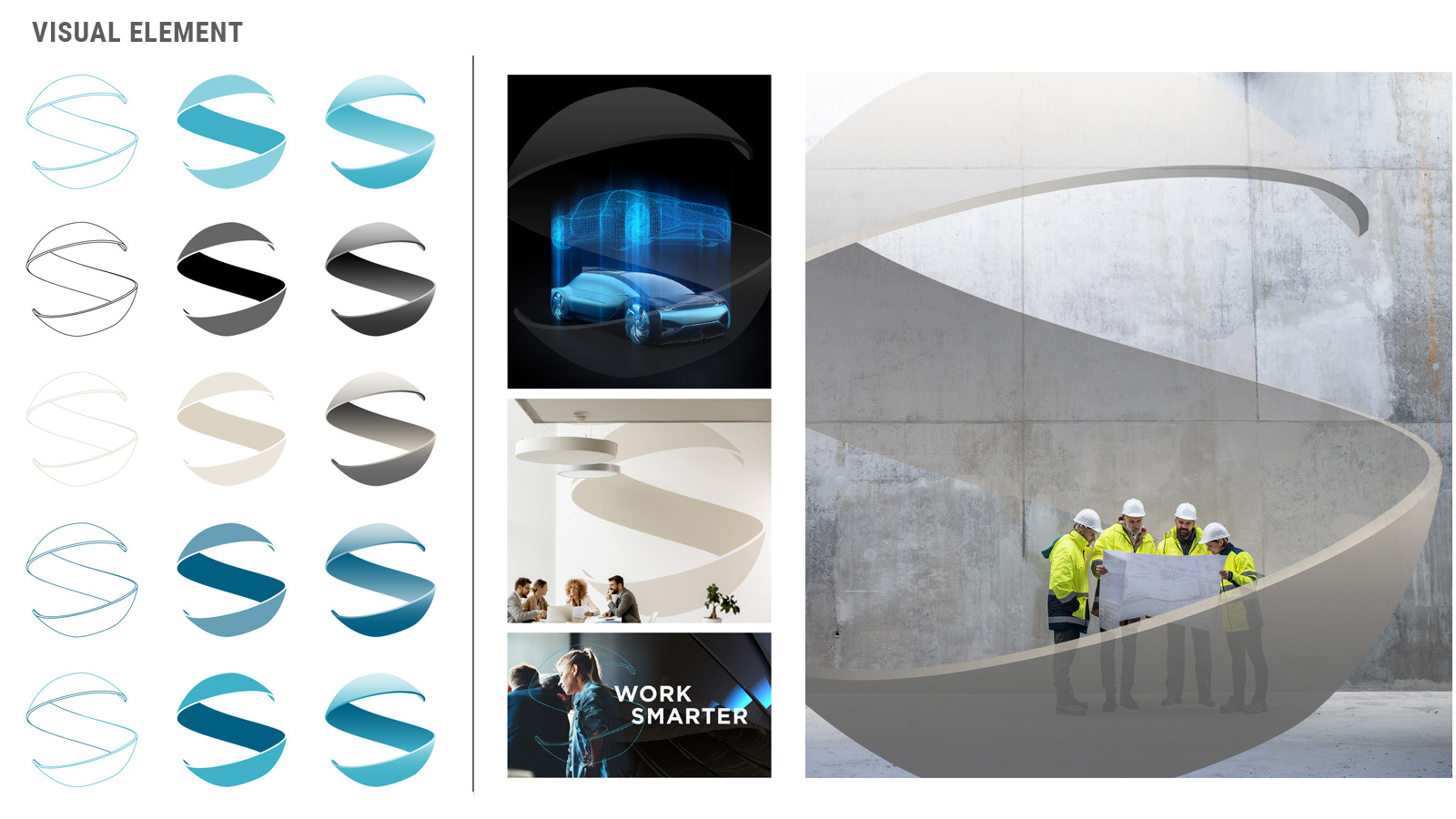
- A graphic element adds both consistency and variety in all visual communication.
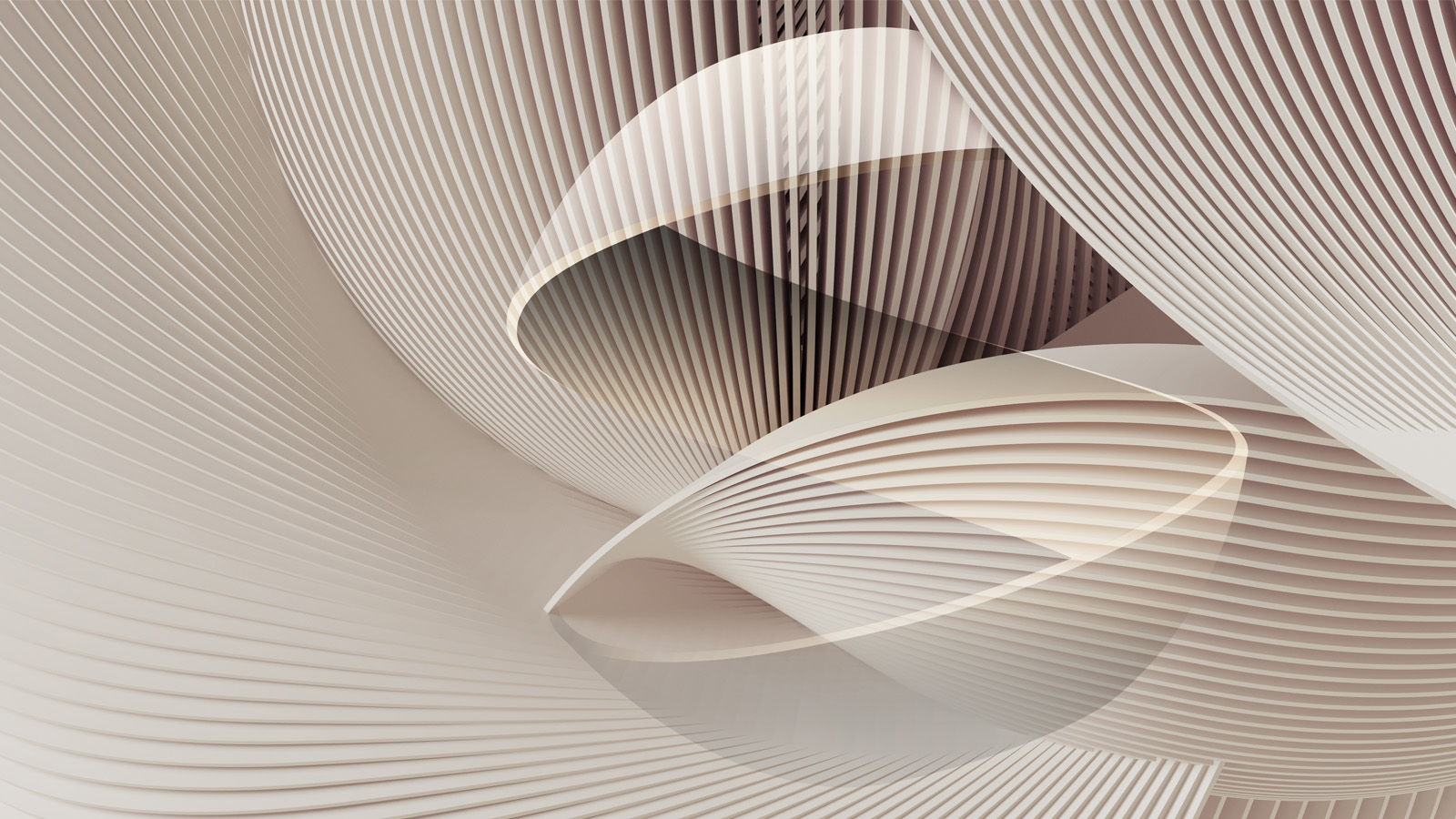
- Abstract 3d elements express both the offer and, more importantly, a hint of future possibilities.
- SoMe posts have a clear verbal structure with a highlighted word and more expressive images.
The visual expression was formalized in an online brand platform where guidelines, examples and
templates is easy to comprehend and access. Next step will be to complement it with an employer branding
platform.